From scanning receipts to a first Shop purchase.
Designing onboarding that helps users understand, try and trust a new way to earn.
Overview
Fetch users knew one behavior: shop, submit a receipt, earn points. Fetch Shop asked them to start in Fetch before an online purchase, then check out with the retailer.
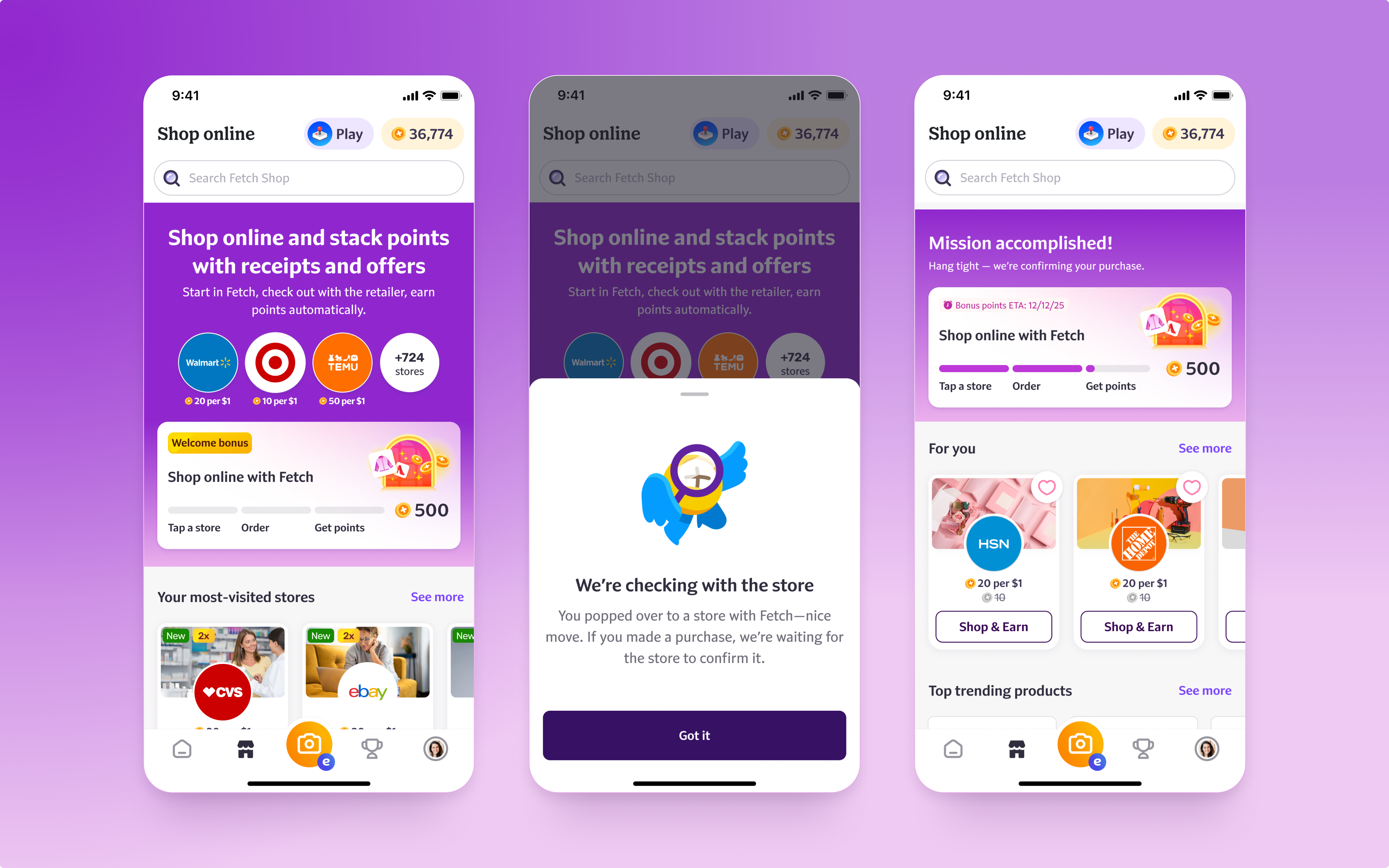
The challenge was to make that change feel like a simple extension of familiar shopping habits. I designed a new-user experience inside the Shop page combining a short explanation of the model, familiar retailers, a first-purchase Welcome Quest and visible progress through the purchase-and-rewards flow.
The problem
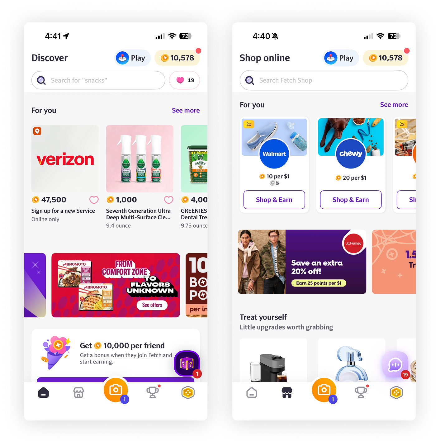
The existing experience asked users to choose a shopping opportunity before they understood how Shop worked. Some thought Shop was a place to redeem points; others couldn't tell it apart from receipt-based earning. A dense mix of retailers, products and point values made learning harder.
The confusion continued after checkout. Users didn't expect points to stay pending, or know where to find them — with a 3–90 day arrival window, expectation-setting was part of the activation problem.
Opportunity
How might we help someone who knows Fetch as a post-purchase rewards app confidently make their first Shop purchase, without overwhelming them or overpromising rewards?
This wasn't a redesign of receipt submission or gift-card redemption. The business challenge was the path from viewing Shop to selecting a retailer, visiting it and completing a first confirmed purchase.
Research
I built on UX Research's June 2025 activation study: unmoderated tasks with 16 participants, split between people new to Fetch and existing eReceipt users new to Shop. One audience needed to understand a new earning method; the other needed to understand both Fetch and Shop.
of surveyed engaged non-converters said they needed a better understanding of how Shop worked — a comprehension barrier, not a discovery problem.
We started with A/B testing a new First Purchase Quest
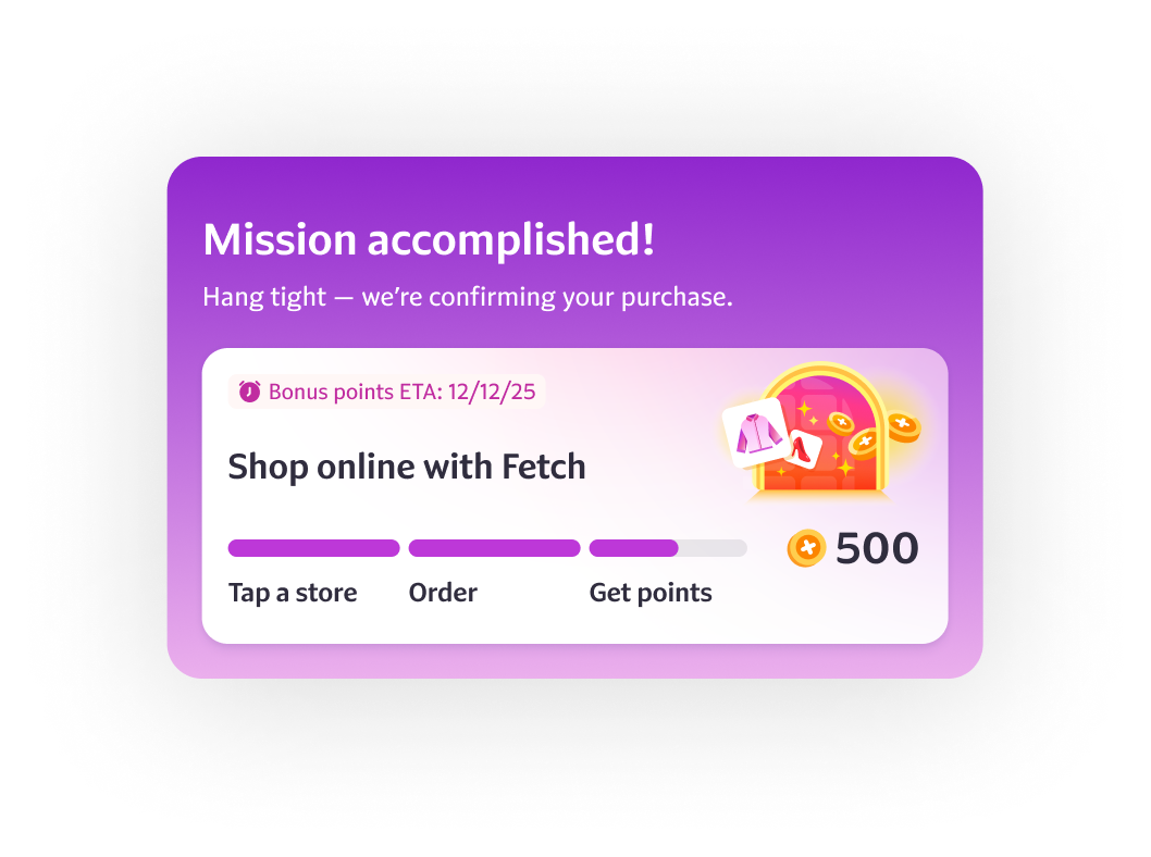
"I really like how there's a bar that fills in. It gives you that feeling when you're playing a game."
An evaluative study with five U.S. participants reported an average motivation of 4.4 out of 5 to complete onboarding for a 4,000-point Welcome Bonus — driven mainly by the bonus, with strong appreciation for the game-like progress indicator.
This indicator also set a more realistic expectation about when pending points typically arrive.
Meanwhile, we conducted quick and dirty usability testing on additional changes to the onboarding UX.
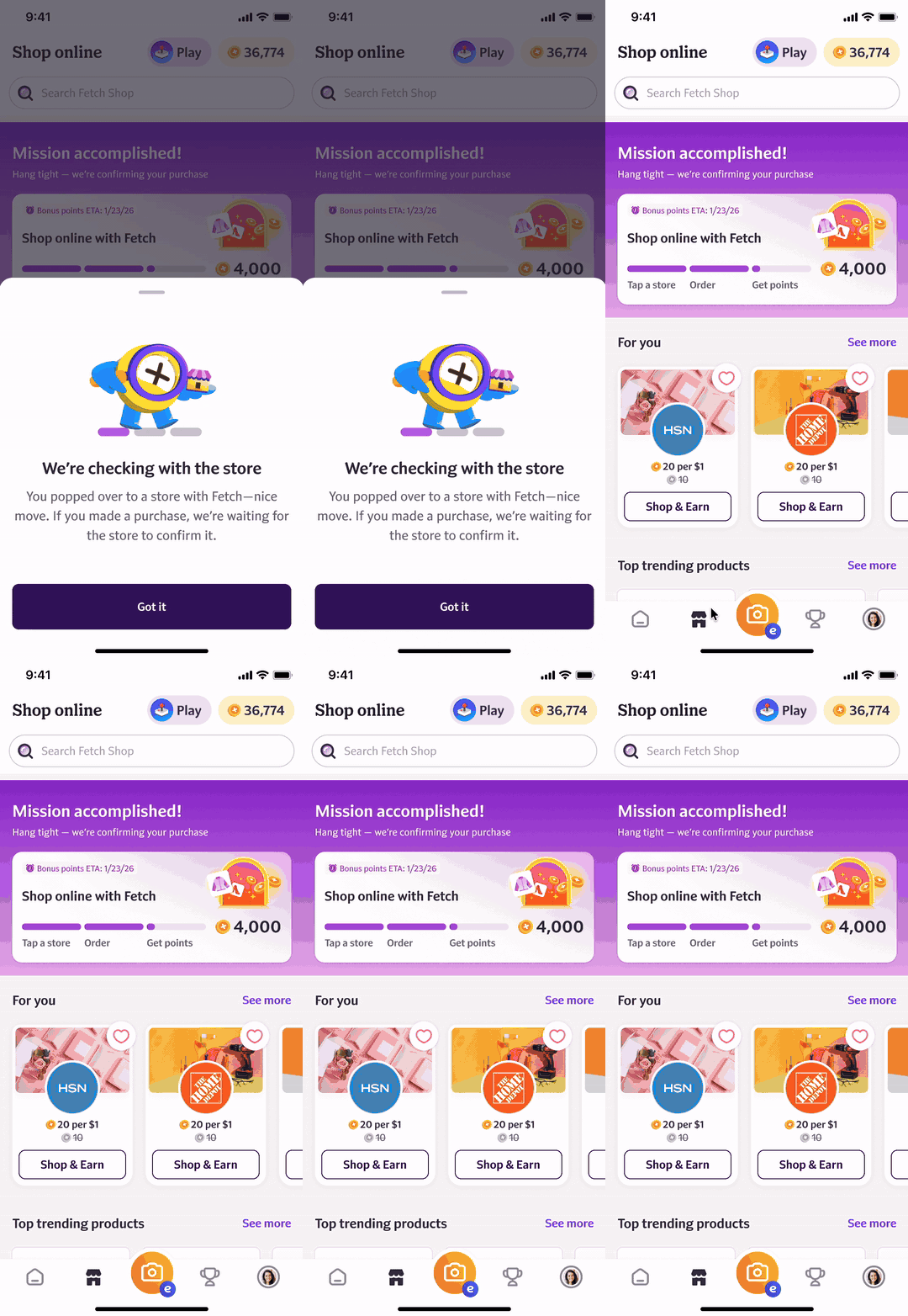
Onboarding system vs tutorial
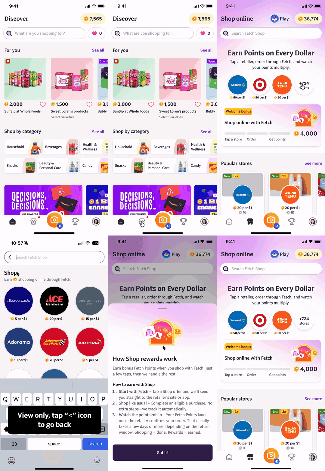
I approached onboarding as a set of user and transaction states rather than instructions to dismiss: existing Fetch users, entirely new users, people who visited a retailer without buying, purchases awaiting confirmation, and canceled or returned orders.
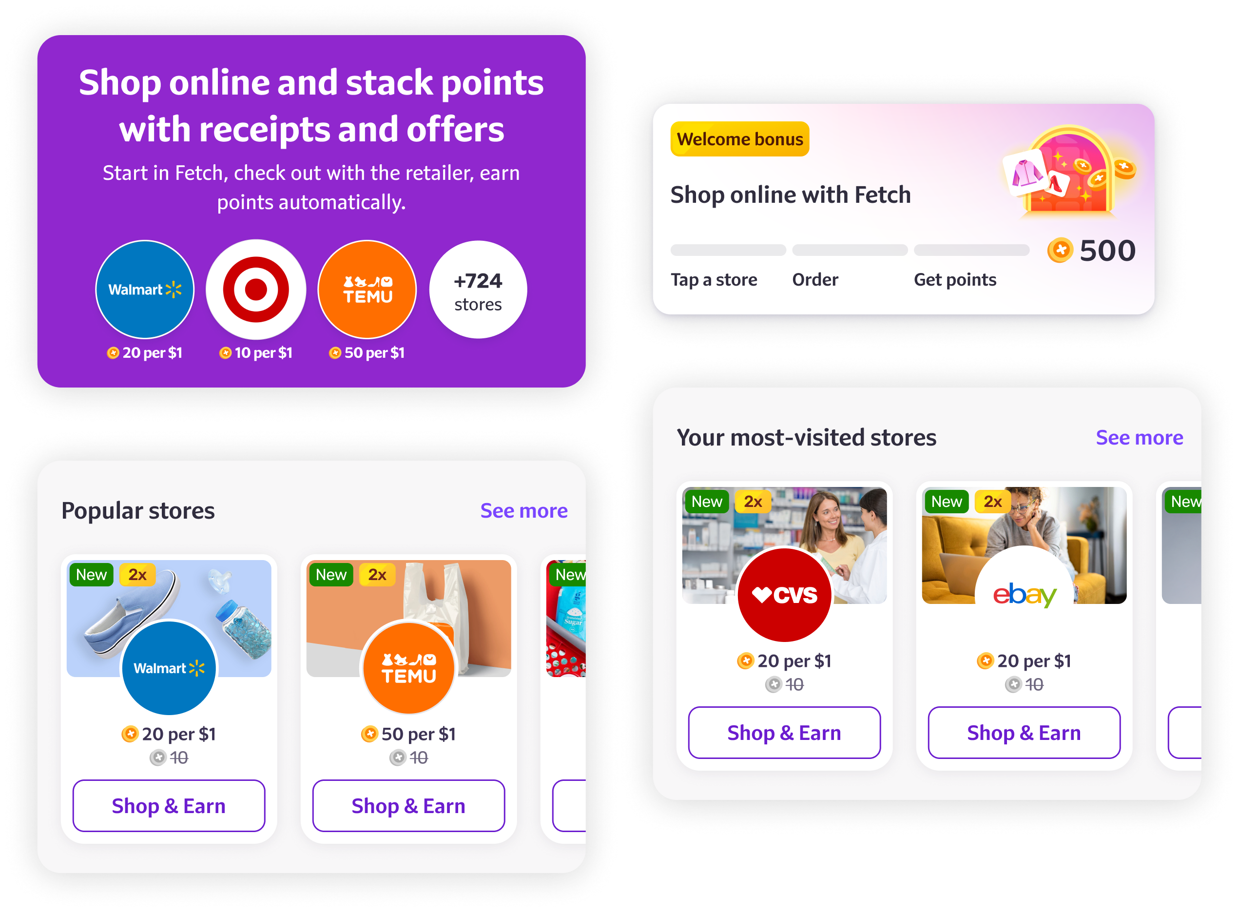
The architecture centered on three reusable elements: an educational header, retailer shelves and a stateful Quest card. Users with enough receipt history saw stores they already used; others saw popular retailers.
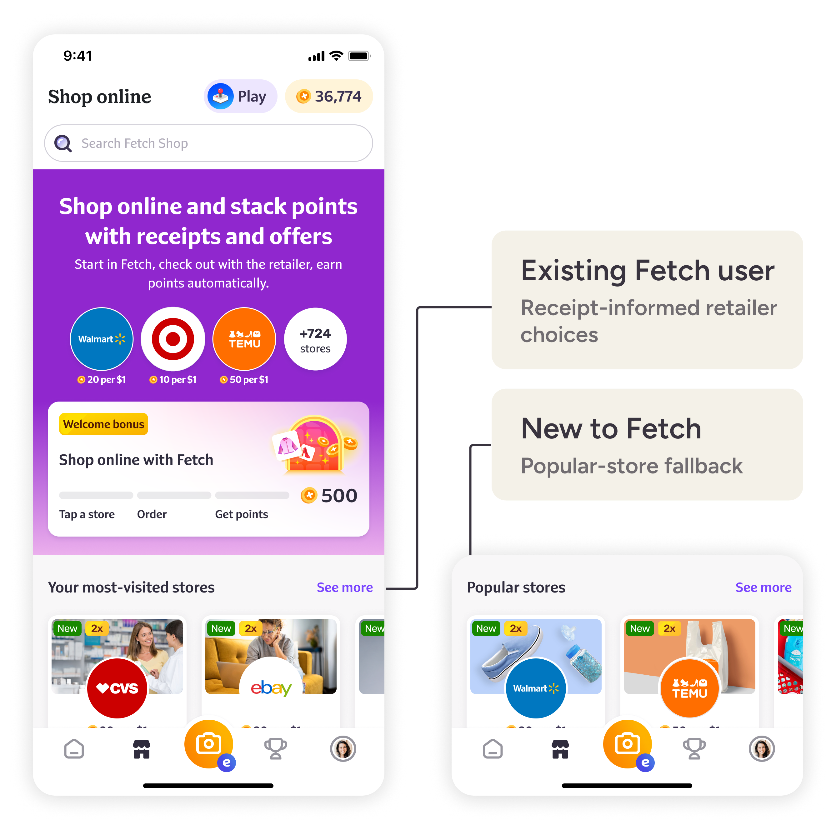
Make the first decision easier
The entry experience answered four questions: what Shop is, how to earn, where to start and why it's worth trying. The header positioned Shop alongside receipts and offers: start in Fetch, check out with the retailer.
Familiar retailers sat close to the explanation, turning an abstract value proposition into an immediate action.
The Quest paired three steps — "Tap a store," "Order," "Get points" — with a concrete reward.
Explain more when needed; stay present afterward
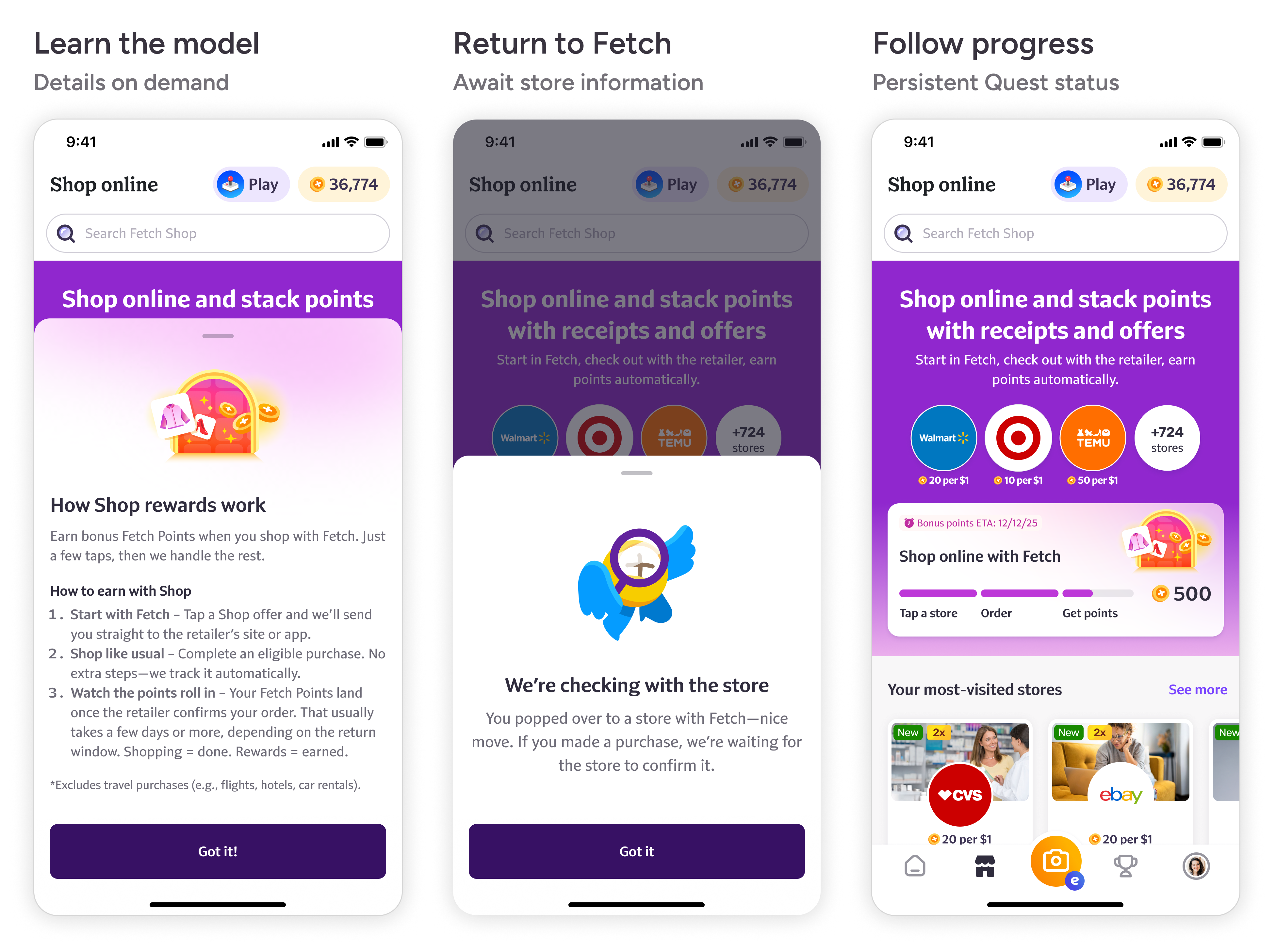
Tapping the Quest opened "How Shop rewards work," explaining the retailer handoff, eligible purchases and store confirmation — on demand, instead of a mandatory tutorial.
On return, "We're checking with the store" acknowledged the visit without claiming an order. Its conditional wording — "If you made a purchase" — mattered: a two-minute retailer visit signals engagement, not proof of purchase.
The scope tradeoff: I focused changes on the header, Quest component and bottom-sheet pattern rather than rebuilding checkout or promising instant confirmation — clearer status, not a new tracking system.
Results
The new onboarding landing page drove a 34.88% increase in new Shop purchases.
Participants responded to the incentive and progress visualization, including a sense of accomplishment after a simulated purchase. Pending messages and estimated timing were appreciated, though some still found the wait long.

What I'd test next
The test showed motivation. The next iteration must show that users can confidently act on it.